
Let’s face it: The phrase “enterprise web app” doesn’t exactly conjure visions of usable, attractive software. Visual design isn’t often a priority; given finite resources and paying customers, the choice between the next big feature and improved aesthetics usually comes down in favor of the feature.
That’s true even at a company that values design like Heap, which offers behavioral analytics for websites and mobile apps, without your needing to know the data questions you want to ask before you launch. When I joined as VP of Design, it was with the recognition of design debt we knew we wouldn’t be able to fix on day one. Instead, I started a design debt backlog that we’d tackle over time and looked for opportunities where systemic progress could arise out of feature work.
Over the course of 2018 this resulted in numerous UX improvements and some consolidated styles. But it didn’t touch a fundamental problem: Our look and feel was dated, and over time — and in the absence of designers — it had fragmented into inconsistency. While there’s no easy way to quantify how the look and feel affects user sentiment or prospective sales deals, it was a concern.
So, in October 2018, I sat down with our CEO, chief marketing officer, chief revenue officer, vice president of product, and front-end engineering lead. We agreed a revamp of the look and feel needed to happen at some point, and we had a short window of engineering time on the schedule. We decided to go for it.
But our engineering window started within a few weeks and closed around the end of the year; there wasn’t much time. How could we update the UI of our entire app, from design to launch, in three months?
No mood boards, no focus groups, no stakeholder interviews: We went from decision to design, fast.
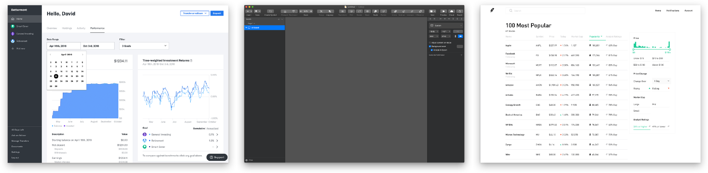
But we didn’t want to design in a vacuum. Our two-person design team (me and our product designer, Ray) gathered screenshots of products that might serve as inspiration. I was intrigued by the simple elegance of Sketch’s dark mode and Blender’s forthcoming redesign, as well as Betterment’s mix of flat, bold lines with sophisticated typography and bright color, and Robinhood’s spare, technical look.
Then, we each got to work mocking up a typical Heap screen in two to three new styles. But what were the specific requirements and constraints? How would these new styles relate to our broader brand as represented on our website?
It would be bold to suggest we ignored all of that and did whatever we wanted. It might be partly true, but it would be an oversimplification. Here are the principles we based our abbreviated design process on:
Armed with five round-one options, we pulled stakeholders into a room and discussed, ultimately selecting one design of mine and one of Ray’s.
I didn’t want our final design to feel like it was exclusively mine, or exclusively Ray’s. I’m a fan of designers working in pairs when possible, as the result is often stronger than what either would come up with alone. So Ray and I swapped. He did the next iteration of mine and I did his.
This second iteration caused our two designs to converge, making the choice less about one distinct style versus another and more about typography, the style of UI elements and controls, and color scheme:
So, great. We had one mockup. Not a design system. Not a style guide. One mockup. And we had engineers ready to get started. To stay within our short window of time, we’d have to work in parallel, building out the system as the engineers implemented it. That we achieved this without rancor (and with such a high-quality result) is remarkable, and a testament to how collaborative the team is at Heap. A few techniques helped:
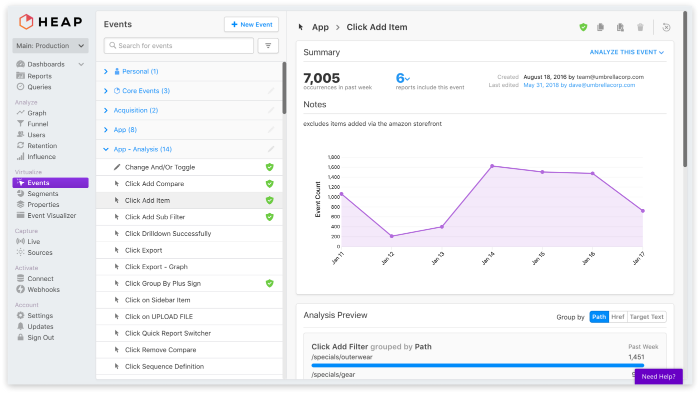
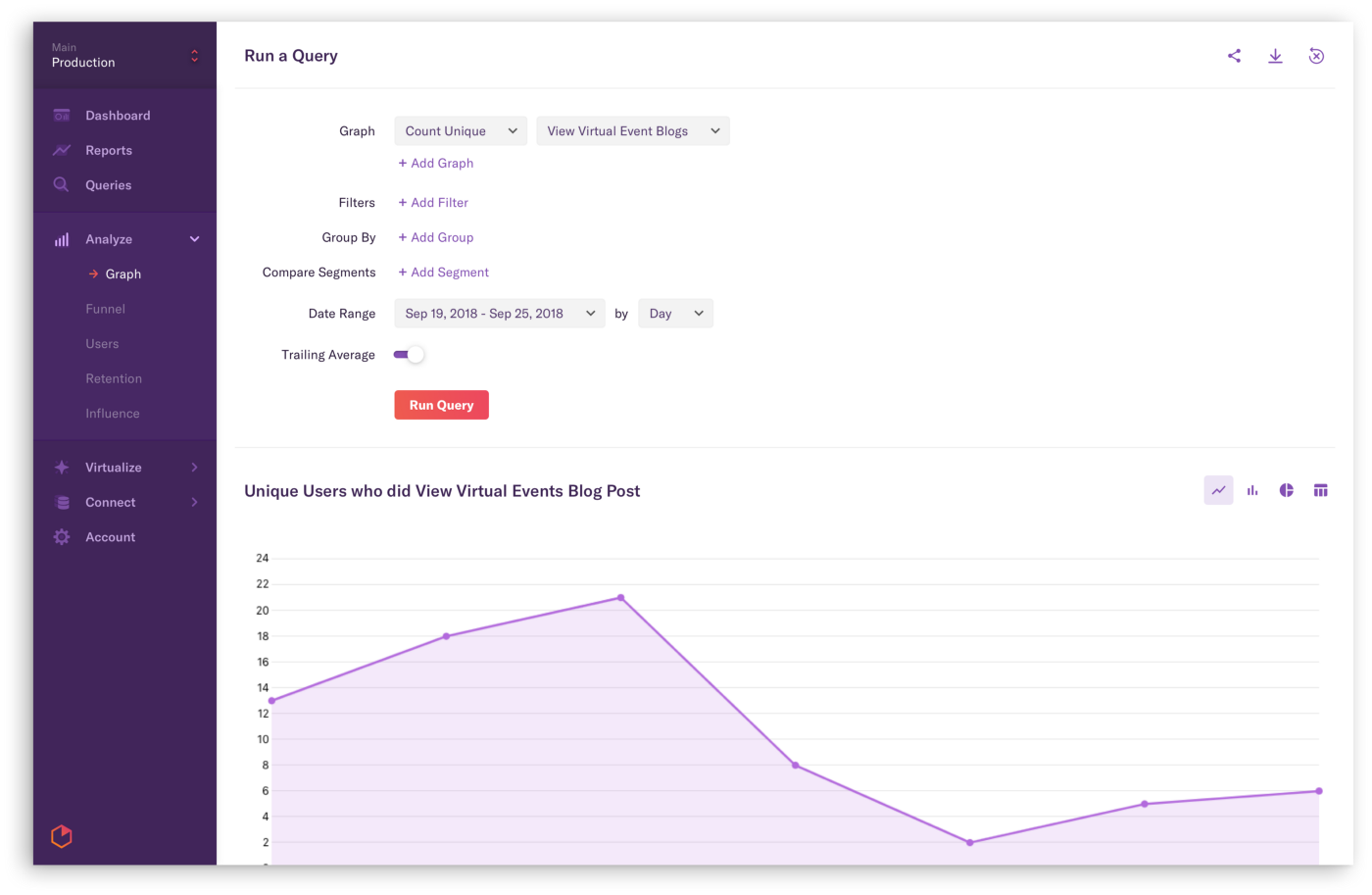
Over the course of the project we refined our style and system, most notably switching from a dark purple to a light gray sidebar. That was Ray’s doing, and it took me a while to get used to it — but I love how clean and modern the result looks. And, it served as a catalyst for us to go more and more minimalist over time — to keep decoration to a minimum and let the data shine through.
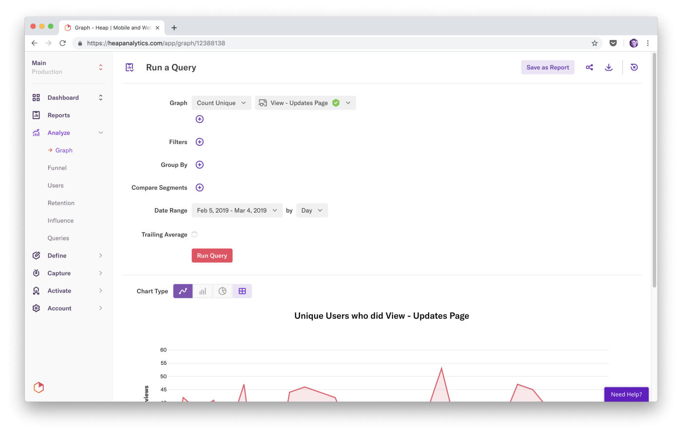
That minimalism also helped us achieve the goal of a UI that feels clean and open without an overabundance of whitespace. Through incredibly lightweight cards, subtle shades of gray, simple separators, and yes, judicious use of whitespace, we created a modern look and feel that supports reasonable data density.
Redesigns like this are notorious for their negative response: To existing users they can feel like change for its own sake. Because that change calls attention to previously ignored details, users often attribute unrelated, pre-existing issues to it as well. They might feel like the app is slower even if actual performance is unchanged, or “discover” bugs that are ages old.
Visual work is highly subjective. Inevitably some users just won’t like it — and it’s not like they’re wrong. (Because this is the internet, though, that dislike is sometimes expressed as “Your design team is incompetent and my gerbil could design something better.” The correct response is, of course, to recruit the gerbil.)
Here’s what we did to mitigate potential negativity:
We were well prepared for hatred when we launched the redesign, but we didn’t get it. The reception was overwhelmingly positive. A post-launch, in-product survey asked customers how much they liked the new look, and on average they gave it 7.6 out of 10. (If that seems low, recall that “nobody notices” was an acceptable outcome.)
That’s not to say everyone loved it. Here’s some customer feedback, both good and bad: